Having A Bad Day?
Add A Little Joy!
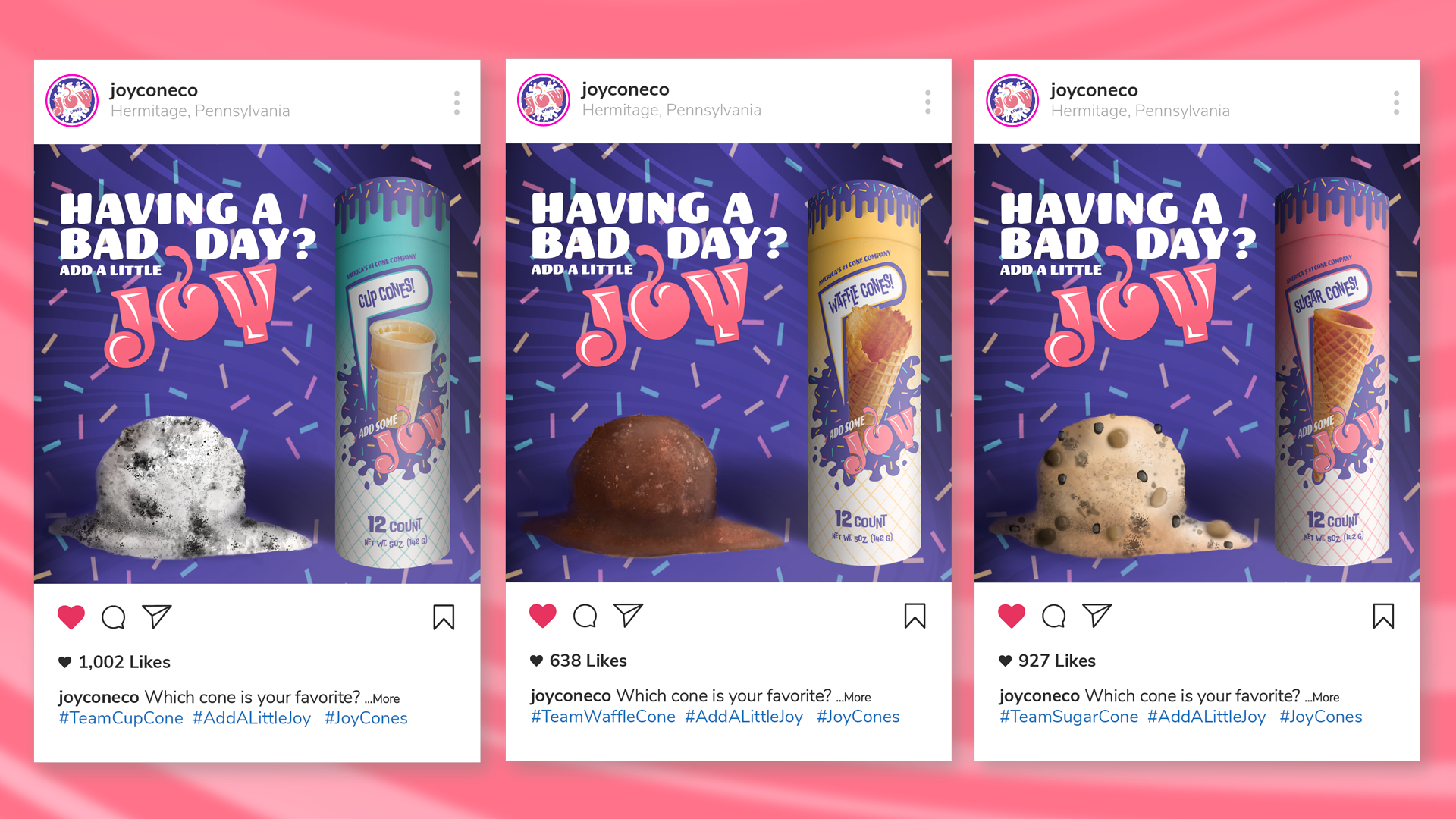
This container concept design and rebrand was a delight. Intended to protect cones from easier breakage and in concept make it easier for consumers to access with less waste compared to other cone apparatuses that often include styrofoam cases in their packaging.
I wanted my design to reflect the classic 1950’s americana look in reference with their original and current branding. While pushing it even further with direct influences from the period's popular googie architecture, I wanted a fresh and fun new look that would appeal to the masses but especially children and young women, especially mothers, who are often credited as being some of ice cream's biggest consumers.